In my kitchen I have a storage bench up against one wall. The seat cushion part is covered in some beautiful blue African fabric, a lovely gift from a good friend. I have a back-up cover too, in a different, more multi-coloured African fabric. The bench is lacking in cushions though, to make it more comfortable and to add to the colour in that corner of the room. This I want to change but found myself stuck for ideas...


There is the obvious plain fabric option (but which colour/s?); but there's something chilly about that end of the room, so ideally I'd like to maximise warmth with a clash of sunshine-y patterns. But that's where I got extra stuck. Not my comfort zone. Whichever cushions I choose probably ought to tie into the rest of the room too, which includes a pale, mustardy yellow and an Yves Klein blue, plus a dash of orange.
 |
| Bench cover one |
 |
| Bench cover two |
So I asked the lovely Laurence Kanza, of La Petite Congolaise, an expert who I have featured before here, if she'd give my bench a virtual makeover with some of her beautiful cushions (ie, via the magic of Photoshop; and please excuse my dubious skills on that front). Here's just some of the lovely stuff Laurence sells:


Thank you Laurence – and over to you...

Colour is a quick and easy way to transform the mood of a home. The world of wax prints offers an added dimension with it’s myriad designs and colour combinations. If you are new to wax prints or a little overwhelmed by the variety, I offer you three quick tips:
# 1 Relax – allow yourself to be taken in by the abundance of choice.
# 2 Trust your instincts – go for what you love, your heart will tell you if a print right your home or not.
# 3 Take your time and enjoy yourself – colour is the perfect winter pick-me-up!
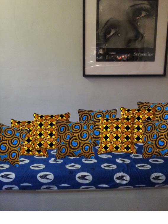
Bench cover one: blue bird print
This is an old print design is known as “Hirondelle” (swallow) in the Congo. Although this print can be found in a variety of bright colours, here the cool, pared down combination of blue and white makes it a perfect backdrop for colour.
Makeover # one 'Repeat After Me'
Combination to try: Juno x 3


How this combination works
- Some prints naturally lend themselves to repetition, in this case, the circular theme becomes a fun visual indulgence
- Restricting the palette to a few shades allows the designs to be seen at their best
Style tip Add plain navy blue cushions creates a “pause” among the circles
Makeover # two 'Bold Geometrics'
Combination to try: Juno + Gilles

How this combination works
- The uplifting combination of yellow and blue make for a quirky, yet harmonious contrast of old and new
- Although not an immediately obvious pairing, Gilles injects an unexpected degree of individuality and character
Style tip A continuity of colour will enhance the warm and welcoming mood within the most social part of the home.
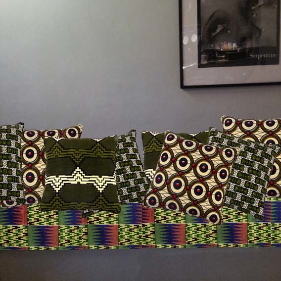
Bench cover two Kente print
This is a wax print interpretation of strip weaving (Kente), one of West Africa's oldest art forms. The beauty of Kente designs is the variety of patterns found in one cloth; however the key to working successfully with Kente designs, is balance – the Kente print is the star of the show at all times.
If you are interested to know how traditional strip weaving (Kente) is made, check out these clips on YouTube (one and two). The skill involved is awe inspiring.
Makeover # one 'Understated Bench Fellows'


How this combination works
- By staying within a predominantly green palette, the yellow and red of the print are emphasised without overwhelming the space
- The geometric pattern in Marc subtly mirrors sections of the kente without competing for attention
Style tip Take your cue from your particular Kente colour scheme and work within its parameters – think complement rather than clash
Makeover # two 'A Mixed Affair'


How this combination works
- Adding Marie-Jeanne balances out the red of the Kente print
- Juxtaposing geometrics brings visual interest, yet still allows the Kente to maintain centre stage
Style tip The extra pop of red creates a sense of warmth to the cold corner of the room
*******
Wow, thank you Laurence, that was so interesting and helpful. I've learnt lots about how to grapple with lots of pattern and got over my fear of being bold with these colourful textiles. (By the way, there are some more tips from Laurence here in case you're interested).
Now all I have to do is make a decision... Which would you go for?
That bird fabric is fantastic- especially with all those blues
ReplyDelete